When I started to take these pictures for these photo-shoots I walked all around town to try and find suitable places to take them. For my first picture on the top left I went into foster square near the train stations tunnels, I chose this place because it is right dark and dingy round there and it fit in well with Historical things because of the old buildings and the old tunnels so that is why I chose this place. For the second picture I chose a place that is quiet but where there is a bit of art. I came here for this picture because it is very bright and colourful and it is also the same colour as my object so I thought that they would blend in well together. I could of chosen a different location to get this picture but this colours blended well with my object. If I was to do this photo-shoot again I would try out different places like all the underground walk near the media museum because that's mainly where all the arty things are outdoors. To make these pictures better I could of took them at a different point instead of holding them at the same angle all of the time. The right hand side pictures lighting was a bit bad because all of the lighting towards the top of the picture is bright, where as towards the bottom of the picture it is quite dark. The bottom half of the left image is in focus, and the top part of the right photo is in focus. So if I was to do this shoot again I would make sure that the full picture is in focus. Overall I think that the final pictures turned out okay once I put them together.

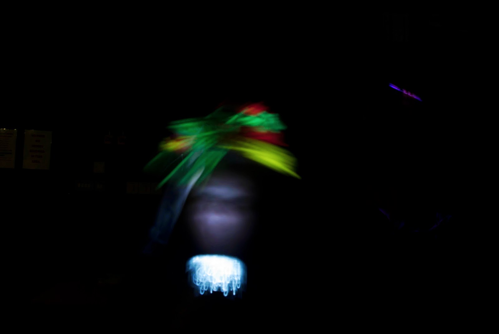
My location of these images are also in the town centre. These pictures where at the side of each other so to get both of them I had to take the two pictures separate. Both of these pictures link in with the art genre, although one was supposed to be outdoors and one was supposed to be indoors, I like both of them so decided to put them both together. Although the right picture is partly out of focus I like it because the object stands out the most but you can also see the art in the background, but I find it good just how the object is the first thing that you see when you look at the photo. The lighting and contrasts for my second photo are good because they are all bright and they stand out well, they aren't dark and unappealing to look at. Overall I like both of these images even though I used the right hand side image again, although I only did this because they was my best two pictures that linked in with art. I wouldn't change anything about these photo's or change which pictures I put them with.

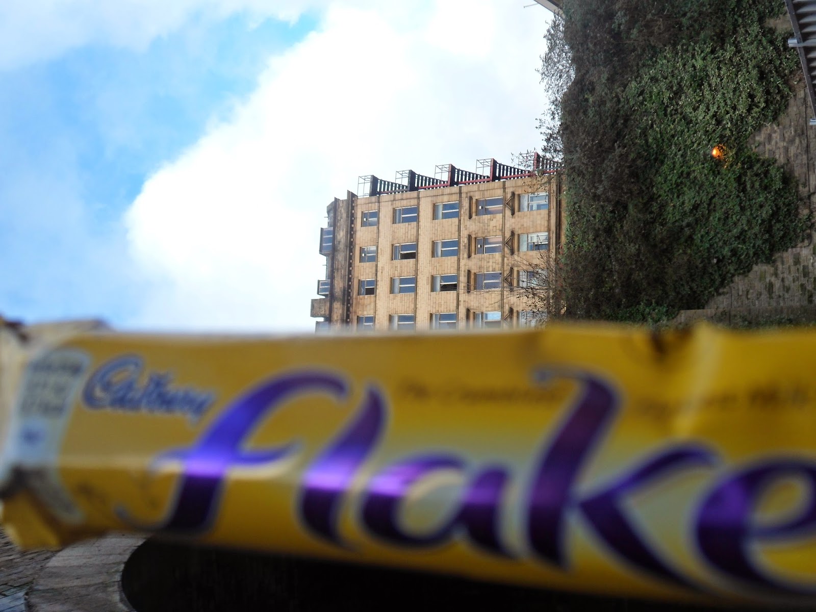
My location for the first picture was in the old building I took this picture to link in with Historical and also Industrial. For the right photo I went into foster square train station because that also links in with historical and industrial because they are things that have been there for a long time. I also chose these locations because its different to what everyone else was doing so it was just an original idea. The left photos viewpoint could be made better by holding the flake in a better position and at a better angle. Same goes for the right photo I should of taken a few of the same photos but holding the object in lots of different angles to try and find the best one. The right photo is slightly out of focus so if I was to go back and take these photos again and I would make sure they was in focus so that when it comes to choosing one id have one that was in focus. The reason that part of this photo is slightly out of focus is because the camera is focused on the closest thing too it which is the flake. If it this picture was to be taken so that the camera is as close to the trains as it is the flake then the trains wouldn't be out of focus. The lighting on the left photo works well this is because the glass is all different colours so all of the artificial lighting is really bright and I think that it makes the picture more effective because the colours blend in with my objects colours. The natural lighting on the right photo could be changed so that it is not so bright. I think that if the back ground of the right picture wasn't so bright then it might be in focus a bit more and wouldn't be as blurred. Overall I think these photos went good, but if I was to do them again I would try and improve to make them a little bit better.

This was my first try at a Diptych. These were both art related pictures. I Chose these pictures out of all the pictures I took because they was the most colourful appealing pictures out of the selection that I took. Throughout the photo-shoots art was my favourite genre so I took quiet a lot of arty pictures. My location for these pictures was near city park for the first one on the left, and my location for the right picture was in the building opposite the old building in one of the corridors. I chose the location for the right side picture because I knew I would find a lot of arty things in the building opposite the old building. I think that the view point for the picture with the octopus in is at a good point compared to all of my other pictures, I think that it is good like this because the whole picture is in focus and the lighting in the picture is good. I also think that the view point in the right hand side picture is good because I got the full picture in the photo, but if I had of got it at any angle the picture would still look good because the full photo would still get in the photo as well as that the lighting is also good on this photo. I really like these pictures overall because they both go together well because the octopus has long curly legs, but there is lots of long curly things in the right photo so i think they link together really well.


.JPG)
.JPG)