Wednesday, 22 October 2014

Typography Research


What is Typography?

Typography is the use of typefaces as a meaning of communication. It begun with Gutenberg and the development of moved type. Typography has its ways in handwritten letter forms also. Typography also includes designers who make new letter forms as well so that designers and calligraphers who use these letters can add it as part of their designs. As well as this Typography uses typefaces and the white space around and through them to create a whole design.
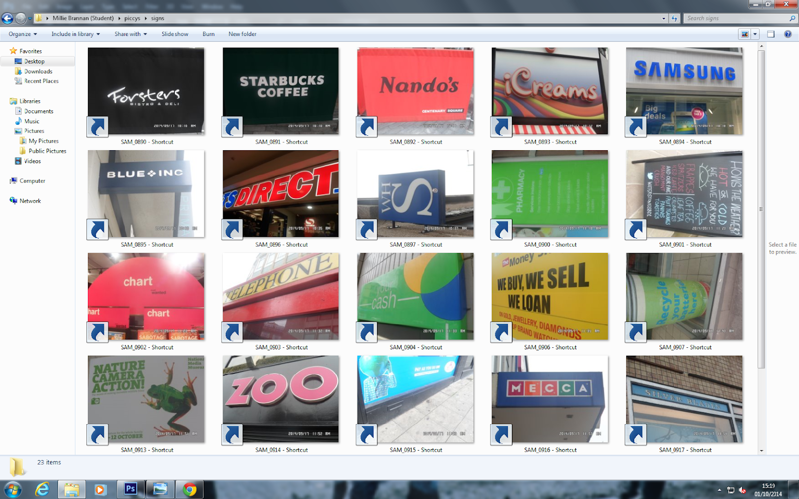


The picture above is a good example of typography. There all different types of texts, in different forms and ways. Typography can be done by hand or on computers with different formats and fonts.


Cubism photo-shoot (CONTACT PRINTS)


These pictures on these contact sheets are from my photo-shoot for the cubism pictures.


3 Design Elements, Typography.

 Typography 3 Design Elements.


 I like this typography book cover because there is a lot going on in it, and it very colourful. I like the use of the text as well, how it is scattered around the page. I think that this makes the book cover a good form of typography. They layout is very effective and has been thought about well to scatter the letters around the page but for it till still make sense.


 I also like this typography book cover because its plain and simple and doesn't look as if someone has had to put loads of effort into it just to even make it look the tiniest bit good. It is very creative with the joined up lines and they have not used too much colour. Although I like this book cover a lot I do not think that it looks like something  I would read. And the title does not tell you much about the story. The way the have put the text makes this Typography book cover.


I really like this this typography book cover because, it has lots of colour, and it has a lot of things going on in it. Its also because it isnt a boring book cover and because they havent been lazy and just used normal text. The thing i like most about the text is how they have put it in on massive speach bubble as if it iscoming out of the cars exhaust. They have used a good type of text as well and also the pattern to go with the text is good too.

Wednesday, 15 October 2014

Cubism 250 words

Cubism

In the 1900, the Eastman Kodak company introduced a low priced, point and shoot, hand-held camera, called the brownie camera. Artists were free to express themselves with paint instead of recording the image. The cameras could do their jobs now. Artists were free to express themselves, Society began seeing things from a fresh perspective.

Artists working in paint were beginning to interest themselves in all new creations in order to survive the competition. The 'cubists' were trying to overthrow the existing order and to explore spatial relationships, free of restraint. 

Between 1907 and 1914, the 'cubists' were actively experimenting. This brief period was revolutionary. George Braque, inventor of cubism. Braque and Picasso worked together ( for Cezanne to cubism). Cézanne's painting was that he did not try to deny the two-dimensional quality of a paintings surface. Photography had begun to replace painting as the tool for documenting the age 

Futurism 250 words


Futurism

Futurism was an artistic movement that came around in Italy at the start of the 20th Century. The predicted themes of futurism where:
* Contemporary concepts of the future.
*Speed
*Technology 
*Youth and Violence
*Different objects 
*Industrial cities 
Futurism was well in and popular with the Italians, although it was though to have been started a lot in Russia, England and other country's. Futurists did lots of art such as:
*Painting 
*Sculptures 
*Ceramics
*Graphic Design 
*Industrial Design
*Urban Design
*Film
*Fashion
*Textiles 


This is a well know futurists work. This piece was made by Filippo Tommaso Marinetti. The name of this piece is: THE FUTURIST MANIFESTO (1909)

I like this piece of work because it is very interesting and is also one of his first pieces. I also like it because the colours stand out loads and because of how he has used the shapes to create this picture. This picture fits in with futurists urban designs because of the person on the bike.


Direction mood board ( Elements of Design)


http://www.vincentborrelli.com/vbb/images/items/107279.jpg


https://blogger.googleusercontent.com/img/b/R29vZ2xl/AVvXsEj40zeT7BhlMo2vGTFLBD-0LQiuPd2WwhnfBKTvrPYAtQu2XYU9OCMPlvrGTlBQ2VhDVAP37is_NUX0Auu8kw5y2Sj8p162ws7R8_SRUjNnSFZ0rAqmnjAFnzk3nGIJCjjLEWirKDwy31U/s1600/Bernard-Artists_Study.jpg
http://paintdropskeepfalling.files.wordpress.com/2012/02/p2150052.jpg


http://paintdropskeepfalling.files.wordpress.com/2012/02/p2150031.jpg


https://m1.behance.net/rendition/modules/62128279/disp/1efd329e67e3af49f4fa120600c340ec.jpg


Photo-shoot ideas task 2 part 1


 Idea 1

For idea one I am going to use David Hockneys style of work. I am going to take pictures of Courtney and I am going to edit them in the style like how David Hockney does. This will be my ideas for my first cubist photo-shoot. Once I have taken the pictures I will choose my best photo out of the shoot and I will edit the photo on Photoshop so that different parts of the photo are different contrasts and maybe even different colours. Then once I have done that I will print my photos out and cut different parts of them up, and rearrange it just like David Hockney has done in some of his work.  


Idea 2


For idea 2 I am going to go into Leeds and take pictures of all of my surroundings such as old and new buildings buses and taxis.. The idea I am using for this photo-shoot is a similar idea to the David Hockney one where you put your picture into a grid and make mini cubes from different parts of the photo. I will be experimenting and doing this with a few of my pictures. Also same with the Leeds idea as well. I will make sure these are done in natural forms of light.


Idea 3


For my idea three for futurism I am going to do a normal photo-shoot on somebody on a plain background inside my house. I will add artificial lighting to take these pictures well inside. After this I will put a picture onto Photoshop and change it too black and white. Then after that I will change the brightness and contrast and levels and curves to try get different shades of blacks and whites. Once i have finished that I will print my pictures off and paint on them like the picture above or with pastels and different coloured pens and pencils.


Idea 4

For my fourth idea I will Take pictures of someone laying down or in a certain position. Then like the background of this picture --------> I will make myself with paint and pastels and pencil colours. And I will put the two photos together in Photoshop and blend them together.


Wednesday, 8 October 2014

Cubism task


This is also part of my cubism task. I like what I have done with these photographs by trimming them and then sticking them back down. I think these photos are affective because I have not just stuck them down as one whole image, but I have experimented with them.


Displaying SAM_1087.JPG

Cubism task black and white shoe


This is my first task on cubism. To do this task I got a chosen item from my room to take pictures of. I went outside where there was neutral light to take these photograph, so that when I took them at loads of different angles all the lighting was the same.


Displaying BLACK AND WHITE BLACK SHOES.jpg

Wednesday, 1 October 2014

Conclusion!

Overall I feel like my project was a success, only because I only just completed all of my work. But I feel like I could of concentrated a lot more and that I could of got a lot more work done. I feel like I could of put a lot more effort into my work as I am capable, but in the time we had I could of done a lot more and could of got more done. If we was to do this again I would definitely try do a lot more work and also put a lot more effort into my work and pictures so that they are not as boring. But overall I think the project was a success because it has been completed On my next projects I will put a lot more effort in, so they can be a lot better then this one.
Displaying CMYK GRID.jpgDisplaying rgb grid.jpg

Print screens

These are all the screen prints from when I was doing my duo tones, I screen printed things as I was going along so that it shows an understanding on how to do things.


2 pictures Still life

These still life images are my favourite pictures I have taken throughout the project so far,both pictures are very vibrant and are full of natural light, if I was to improve on these photos there is not anything I would really change as I like both pictures. There is not a lot going in these photos and they are quite plain but I think that is what makes the pictures better.
Displaying SAM_0965.JPGDisplaying SAM_0977.JPG

2 signage photos

These are my two chosen pictures from my signage photo shoot. I like these photos because they are vibrant and there is lots of colour in both of them. If I was to do anything better with these photos it would of been to take them at a better angle and try get them to a better quality.

Displaying SAM_0893.JPGDisplaying SAM_0920.JPG

Signage contact print

This is my signage photo shoot. I was struggling to contact print these photos because it wouldn't let me do it in Photoshop or bridge as it would not load my pictures up, so i had to put them into a word document and screen print them and copy them on to here. I like this photo shoot because there are a lot of vibrant colours in it. If I was to improve on this i would make sure it would let me contact print them properly in the future.

2 Images from saltaire


These are my two chosen photos from the Saltaire trip I have chosen these photos because they are my favourite pictures that I took on the trip. I like these photos because they stand out the most to me and the images remind me a lot about Saltaire the most. The lighting within the 1853 gallery picture was created by natural light. I like this photo because it naturalistic. Also I like the black westons sign because that has a lot of naturalistic light in the picture too. If i was to improve on these photos I would try get the date and time out of them.


Red duo tone

For my red duo tone I added levels too it after finishing duo toning it. This is because I wanted to add lots of little shadows to the photo to make it look more effective and creative. If I was to improve on this picture i would of tried to add the full photo into the picture instead of just half of it.

Magenta duo tone

This is my favourite duo tone out of all seven of them because, the colour stands out the most and the photo is more clearer even when the duo tone colour has been added too it, This is the only duo toned image I have not added levels too because it has not needed it. If I was to improve on this picture I would of taken it from a better angle.

Green duo tone

The lighting in the image of my green duo tone lets this picture down a little bit because of the lighting when the photo was taken. To improve on this picture I would of needed to take the picture at a better angle so that the light wasn't ruining it. So next time to improve i will make sure I do not make this mistake again.

Cyan duo tone

This is my cyan duo tone. The thing I think I need to improve on the most is the fact that it is an identical colour to my blue duo tone. So what I need to do next time is actually make sure that one is a cyan shade and that the other is a blue shade. If I was to go back and do this again I would make sure that it is actually Cyan colour and not blue.


Blue duo tone

This image is my blue duo tone image, I like this image because I think that the two shades of blue I chose to duo tone it worked well together. If I was to improve on this photo I would add some levels to it so that it would produce different shades of blue all around the photo.